PAOC Spotlights
Picture Power
 As scientists we sometimes struggle to communicate what we do: Diagrams can quickly get complicated, equations morph into a tangle of inky Greek. This week a new vizualisation is proving that the "right" picture, coupled with a healthy dose of planetary connectivity, can mightily capture the public imagination, and perhaps (fingers crossed) help nurture a paradigm shift in public understanding, if not about what we do, then at least about how our planet works.
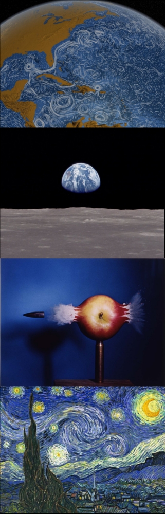
Perpetual Ocean, a video of the ocean circulation from a MIT/NASA-JPL ECCO2 collaboration as visualized by the NASA Goddard Scientific Visualization Studio – which has been going a little viral over the past few days – illustrates surface currents around the world during the period from June 2005 through December 2007. There is no narration, no annotations; The goal of its creators was purely to "use ocean flow data to create a simple visceral experience" exposing an aspect of the planet not normally visible to the naked eye.
Perpetual Ocean – Ocean surface currents from the MIT/NASA-JPL ECCO2 collaboration as visualized by the NASA Goddard Scientific Visualization Studio
This visualization, and others like it, were produced from results of simulations using MITgcm, MIT's in-house numerical general circulation model, a suite of software developed and maintained over the past decade by modelers within PAOC and used as part of the Estimating the Circulation and Climate of the Ocean project, a multi-year collaboration with investigators at institutions across the country and beyond.
The high resolution global model revealed in Perpetual Ocean is an attempt to model the oceans and sea ice to increasingly accurate resolutions that begin to resolve ocean eddies and other narrow-current systems which transport heat and carbon in the oceans.The model simulates ocean flows at all depths, but only surface flows are used in this visualization. The dark patterns under the ocean represent the undersea bathymetry. Topographic land exaggeration is 20x and bathymetric exaggeration is 40x.
MIT's Harold Edgerton forever changed how the world perceives things travelling at speed with, among other iconic works, his seminal 1964 photograph of a bullet passing through an apple. Humanity's view of itself underwent a similarly irrevocable change when it first laid eyes on Earthrise, the name given to a photograph taken during the Apollo 8 mission in 1968 of Earth rising over the lunar horizon. If images of an ocean teaming with eddies can make a Canadian breakfast TV anchor this excited or prompt an Italian newspaper to liken the swirling circulations revealed in NASA's movie to elements in Van Gogh's 1889 work "Starry Night", could Perpetual Ocean serve, in even a small way, to nurture a paradigm shift in the public consciousness, finally tipping ocean as bland-bath-tub towards watery-wonderland, teeming with turbulence?
What's on your screen today - send me your images and movies, HH.
Image caption: (From top to bottom) Still image from NASA's Perpetual Ocean visualization, Earthrise, Shooting the Apple, Starry Night.